

Meet Alina Gallo
A. Gallo Colors studio is lead by artist Alina Gallo who has a background in Italian and Persian paint-making traditions. In 2017, with her husband Giuliano Matteucci, she founded A. Gallo Colors in Assisi following a period of research into Timurid, Safavid and Ottoman manuscripts in collaboration with the Metropolitan Museum Department of Islamic Arts, the Topkapi Palace Library in Istanbul and the Museum of Art at Bowdoin College’s Islamic Manuscript Collection.
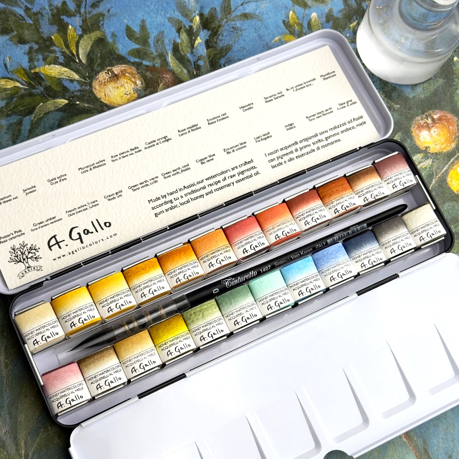
Handmade in Italy, A. Gallo watercolors are crafted according to a traditional recipe of raw pigments, gum arabic from the acacia tree, local honey from Umbria and rosemary essential oil. Every batch of paint is made from premium pigments and hand poured into pans. This intensive process creates a very pigmented, luminous, and pure paint with excellent lightfastness that activates beautifully when wet.
We are lucky to have Alina as one of our wonderful and valued Martha Mae partners, having collaborated on custom watercolor palettes, including our newly released Ghost Ranch Palette.
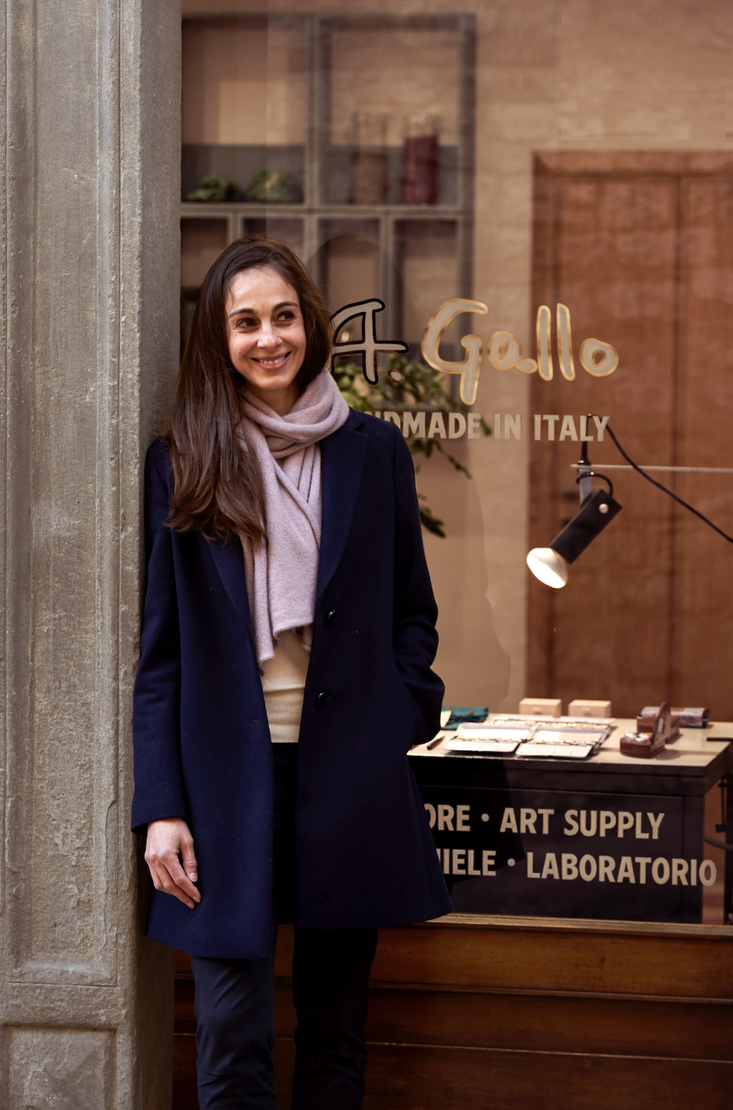
Hi Alina! Tell us a little bit about yourself.
I’m an artist and co-founder of A. Gallo Colors, based in Assisi. My work has always centred around color, both as a material and as a perceptual experience. Over time, that led me into researching historical paint-making traditions, where color is deeply embedded in systems of knowledge, craft, and culture.
A. Gallo Colors grew out of that research, but also out of a desire to make those material histories and highly pigmented, pure recipes accessible again, to bring them into a contemporary practice.
What continues to interest me is how color exists between the physical and the immaterial, something you can hold and grind, but also something that unfolds through perception, memory, and time.
What excited you and sparked your curiosity as a child?
I think I was always very sensitive to color before I understood it as something you could consciously use. I remember noticing how light would change a surface or an environment, how something that seemed like one color was actually constantly shifting.
I was the kind of kid who would bring a sketchbook into the Metropolitan Museum and spend hours drawing the knights in armour and the Temple of Dendur. Looking back, I think that combination of observation, history and making shaped the way I still approach color today.
What prompted your fascination with Italian and Persian paint-making traditions?
It began with a simple question, where does color actually come from? And the deeper I looked, the more I realized that color is never just a visual phenomenon, it’s tied to geology, trade, ritual, and systems of knowledge. I became especially fascinated by the way materials moved across cultures, how pigments traveled through trade routes, creating a kind of cross-cultural pollination where techniques, meanings, and aesthetics continuously influenced one another.
Medieval Italian, 12th-century Bagdad School, Timurid, Safavid and Ottoman traditions are particularly rich in this respect. Whether through fresco or manuscript painting, there is an incredible precision in how materials are prepared and used, but also a sensitivity to how color functions symbolically and perceptually.
Encountering the original manuscripts was a turning point for me, the vibrancy and aura of the color as material is almost corporeal. It’s not just something you see, but something you feel, as if the pigment still holds the energy of its making and provenance. What drew me in was that sense of continuity, that these materials carry layered histories, shaped by many hands and places, but were also still very alive and responsive in the present.
Following your research into Timurid, Safavid and Ottoman manuscripts, what led you to starting A. Gallo Colors? What lessons from historical paintmaking traditions feel most relevant to you today?
After spending time studying these traditions, I began incorporating historical recipes and pigments into my own work. At the same time, I felt there was a gap between the material process of preparing paint and the artist today.
A. Gallo Colors emerged from that tension, an attempt to recreate historical colors without brighteners or fillers, and also to reinterpret them within a contemporary context. One of the most important lessons from historical practices is the idea of working in dialogue with materials. Color is not fixed, but something that reveals itself over time through use.
Will you walk us through the guest experience at the Atelier? Is paint being made in the shop and can customers build their own palettes?
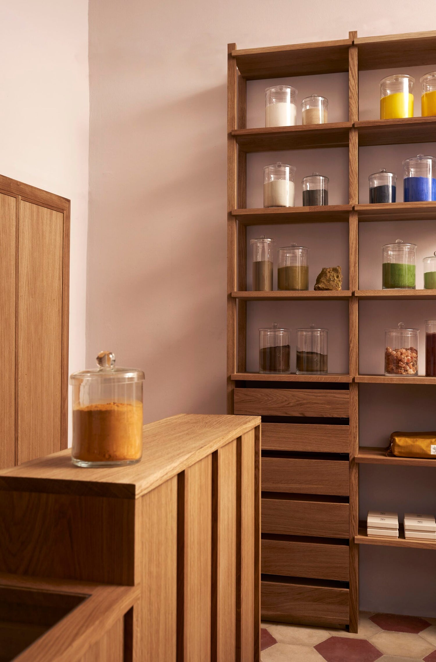
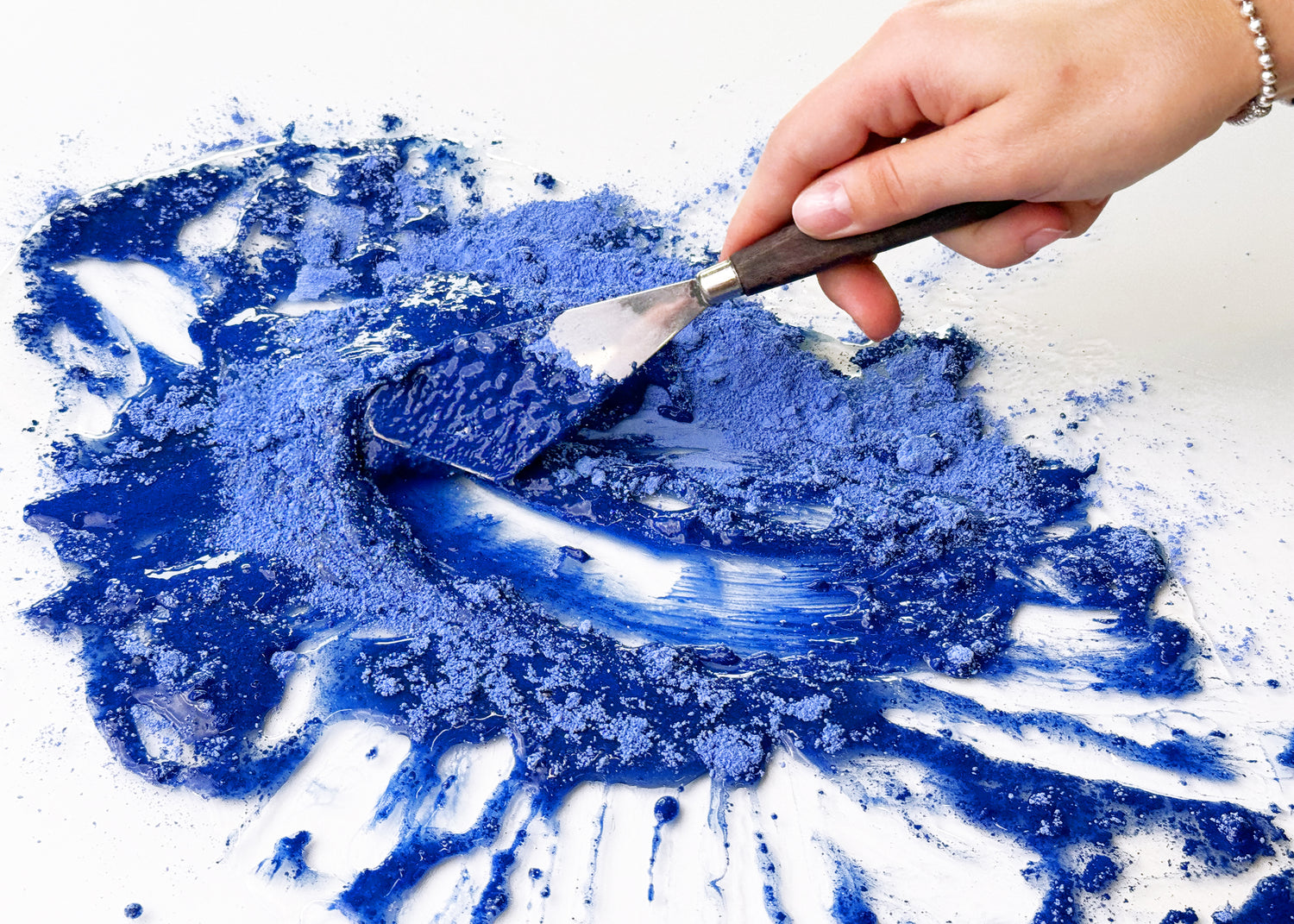
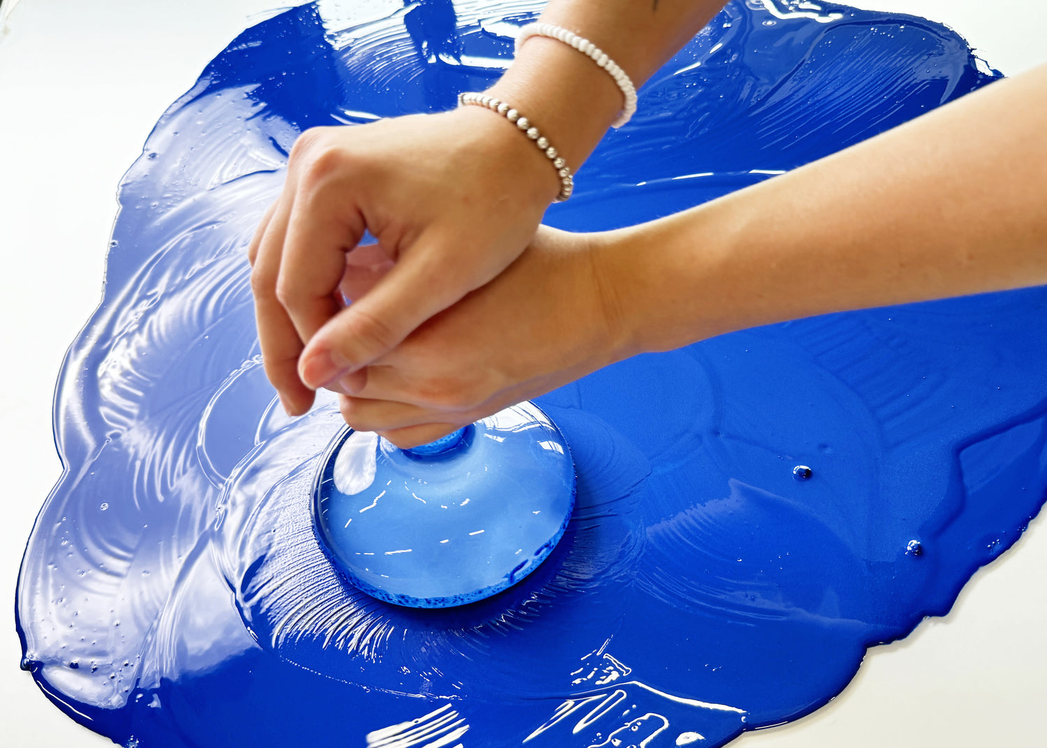
The Atelier is designed as a space of encounter, where the process of making is visible and accessible. Visitors can see pigments, experience a demonstration of how our paints are made, and build their own palettes.
We try to create an environment where people can slow down and spend time with the material, observing how different pigments behave, where they come from and how they interact.
It’s not just about purchasing something, but about developing a different relationship to color and place, one that is more attentive and more grounded in the material.
How do you decide which pigments belong in the A. Gallo color library?
It’s a very intuitive but also research-driven process. We look at material quality, historical significance, uniqueness, and how a pigment behaves within a system of colors.
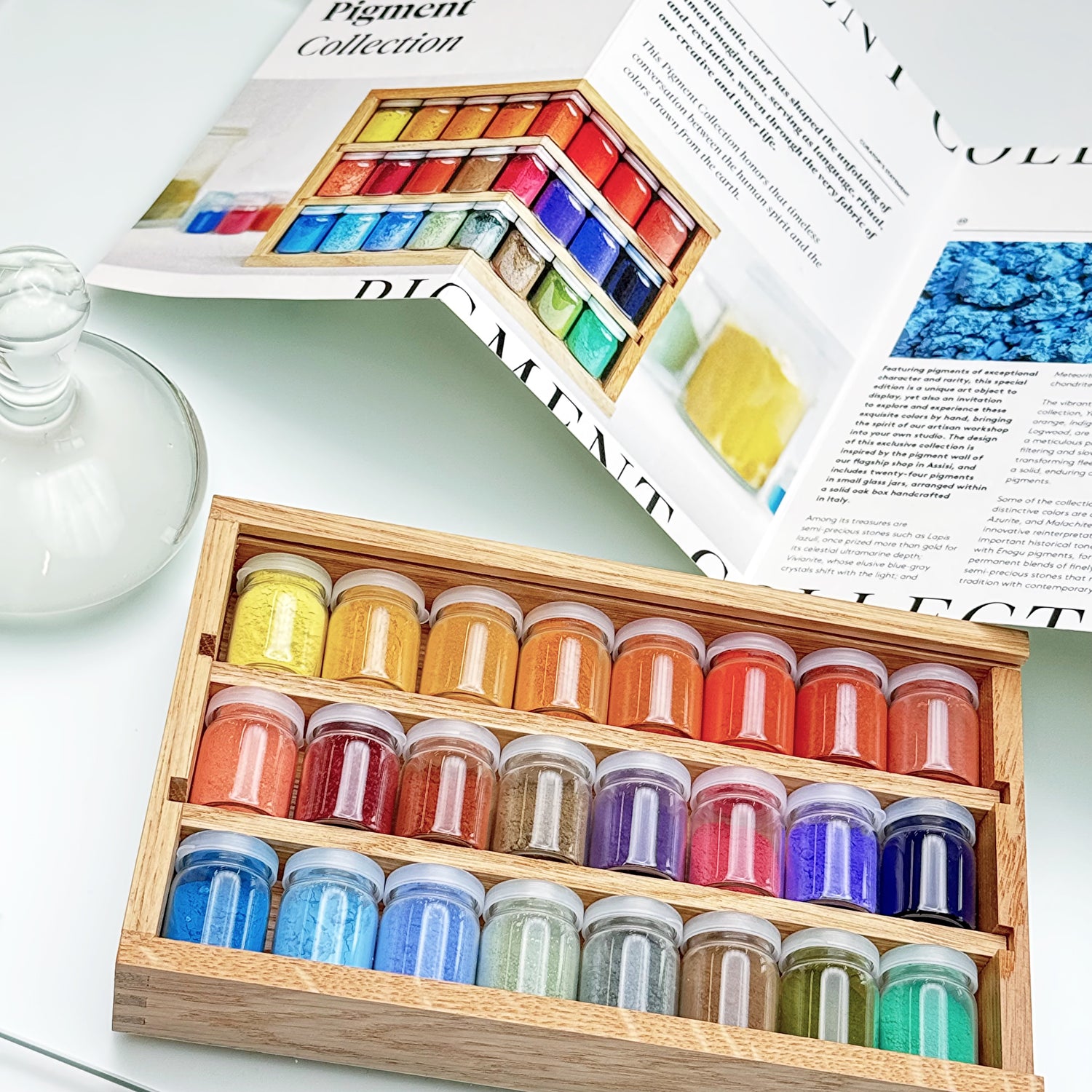
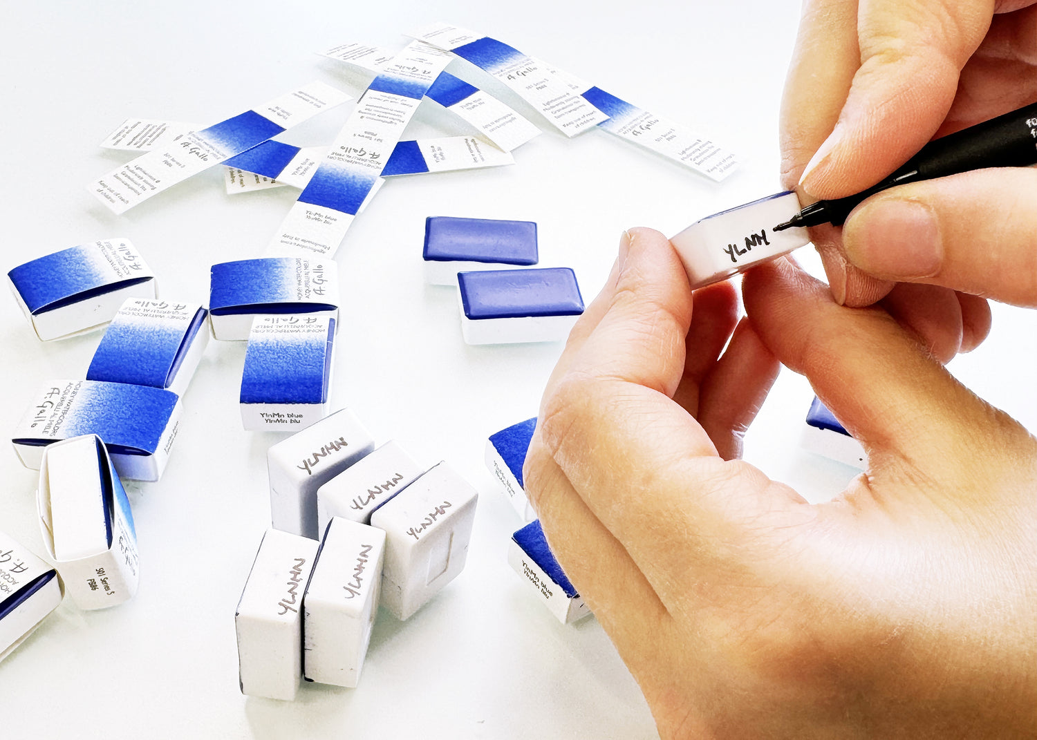
At the same time, we also work with contemporary pigments that offer excellent lightfastness and exceptional qualities for watercolor, and explore materials that offer eco-friendly alternatives to cadmiums and cobalts. We’re interested in how new pigment discoveries, such as YInMn blue, can inspire artists today and dialogue with historical materials.
Because we work on a small scale, we can remain very nimble, producing artisan batches of more unusual pigments, like ground meteorites from the Moroccan desert, Cosmos Orange lake pigment derived from flowers gleaned in Belgium, or Burnt Sienna from the historical quarry at Monte Amiata.
What types of workshops are you hosting at the Atelier? Do you collaborate with other artists on these experiences?
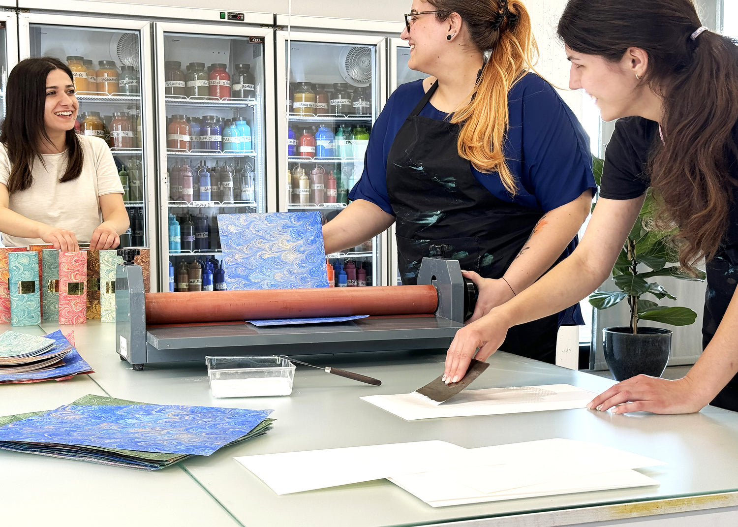
Our paint-making workshops often include a masterclass with a watercolorist, who guides the group in bringing the colors we make to life. That moment, where the material becomes practice, is so important. We are proud to be part of a wonderful community of artists and teachers. Their presence brings different approaches and sensibilities to our studio.
Our workshops are designed as hands-on, restorative, and experimental. We hope they awaken the senses and offer a meaningful connection to the material world, through touch, through color, even through the scent of rosemary oil in the air.
The workshop environment itself also plays an important role, whether in the Umbrian hills of Assisi, near Giotto’s frescoes, within a historic setting like the Chiostro del Bramante, or by the sea in Tuscany. Each location brings its own atmosphere, subtly shaping how color is perceived and experienced.
We also offer paint-making demonstrations in our Flagship Store in Assisi every weekend and by appointment, aiming to offer visitors tactile, immersive experiences that promote a sense of wellbeing and heightened creativity.

What excites you about the Martha Mae x A. Gallo palettes?
What excites us about the Martha Mae x A. Gallo palettes is the opportunity to think about color in a very intimate and contextual way, creating something that responds not only to a place, but to a way of living with objects. Martha Mae has such a sensitivity to materials and detail, and that makes the collaboration feel very natural.
We also love that this is an artist collaboration with painter Jean Cate. A. Gallo Colors is a brand made by artists, for artists, and there’s something deeply personal and empowering about working with tools that are shaped by the same sensitivities and intentions that guide the creative process.
Curating and creating custom palettes are a way for us to explore together how a specific color story, whether inspired by a place or a shared artistic vision, can become an object that holds both material and imaginative depth.
How do you curate a palette? Is there a foundational color combination that needs to be present for a good travel palette?
Curating a palette is really about relationships. We often think in terms of balancing temperature, transparency, and versatility.
A strong foundation for a palette begins with warm and cool versions of the primary colors, then grounding the selection with a few earth tones, like Sartorio Red or Raw Sienna from Monte Badia. Single-pigment colors allow for clean mixes and control, while introducing a few more complex or signature blends can bring depth and atmosphere, colors like our Notturno or Harbor Blue.
A palette can also be guided by an initial reference like a color story, a time period, or a landscape which gives the palette a kind of internal coherence. The Lakeshore palette, for example, might be built around cooler, reflective tones with moments of softness and diffusion, while the Desert palette might lean into warmth and mineral depth.
We also think about how colors behave in layering, how transparencies create luminosity, how more opaque pigments can structure a composition and detail. Earth tones can quietly bring harmony and stability.
What do you hope artists feel when they paint with your colors for the first time? We hope an artist feels a heightened awareness of the material, of the process, and of their own perception.
Each palette is designed as an object of encounter, not just something functional, but something that shapes how you approach painting. The arrangement, the materials, the way each element is made by hand, even the scale, everything is intended to slow you down and deepen your attention. In that sense, the palette becomes part of the experience, not just a tool.
Where do you find inspiration and how do you recharge your creative battery?
We find a lot of energy in visiting museums, exhibitions, and architecture. Being in dialogue with artworks and spaces always helps recalibrate our perception.
With A. Gallo Colors, we’ve also been fortunate to travel recently to Paris and Abu Dhabi for new projects. In particular, the Louvre Abu Dhabi and the Foundation Louis Vuitton were incredibly stimulating, both in their architecture and in the way they shape the experience of light, space, and movement.
And then more simply, time in the park or riding a bike, those daily moments are often where things begin to settle and reconfigure.
Will you tell us about some of the new colors you are working on?
We’re working on several new developments. One is the release of our soft iridescent line in tube form; these colors have a very delicate, naturalistic shimmer that integrate with the rest of our line. The tube formulas have been in testing at our lab for nearly a year and are finally ready to share.
At the same time, we’re developing more material-focused projects, like a special edition of Yirrkala pigments, generously shared with us by the late Steven Patterson of Derivan and the Buku-Larrnggay Mulka Centre. These are historically significant natural earth pigments from the Arnhem Land region, used in indigenous Australian art practices and often connected to ancestral narratives of fire, water, and cultural identity.
Where do you love to hang out in Assisi?
Assisi itself is incredibly inspiring with its medieval architecture, intimate alleyways, and panoramic views. You can move from very quiet, intimate scenes of flowers, doorways, stone stairways to more monumental spaces like the Roman Temple of Minerva or the Basilica di San Francesco with just a few steps.
The café in Piazza del Comune is perfect for sitting in the sun and people watching. And then the hills just outside the town, especially near the Eremo di San Francesco, an ancient forest hermitage, feel almost suspended in time.
What are you currently loving at Martha Mae?
I appreciate how carefully everything is selected. There’s a strong sense of material presence, and an attention to how objects are experienced, not just how they look. That kind of sensibility resonates deeply with me.
I’ve had my eye on the Kaweco Liliput pens, and I also love the Grandmont Street ceramic collaboration.
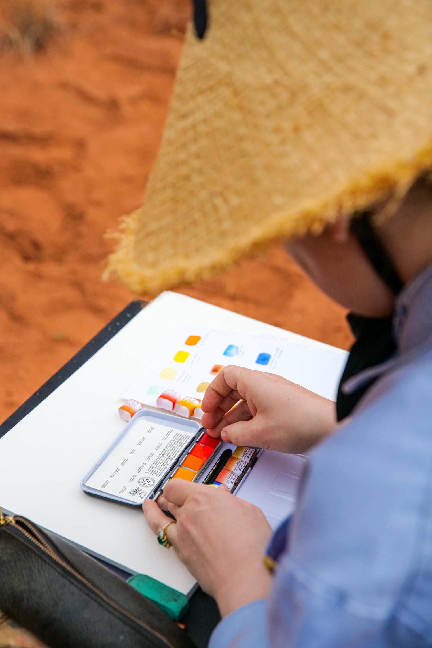
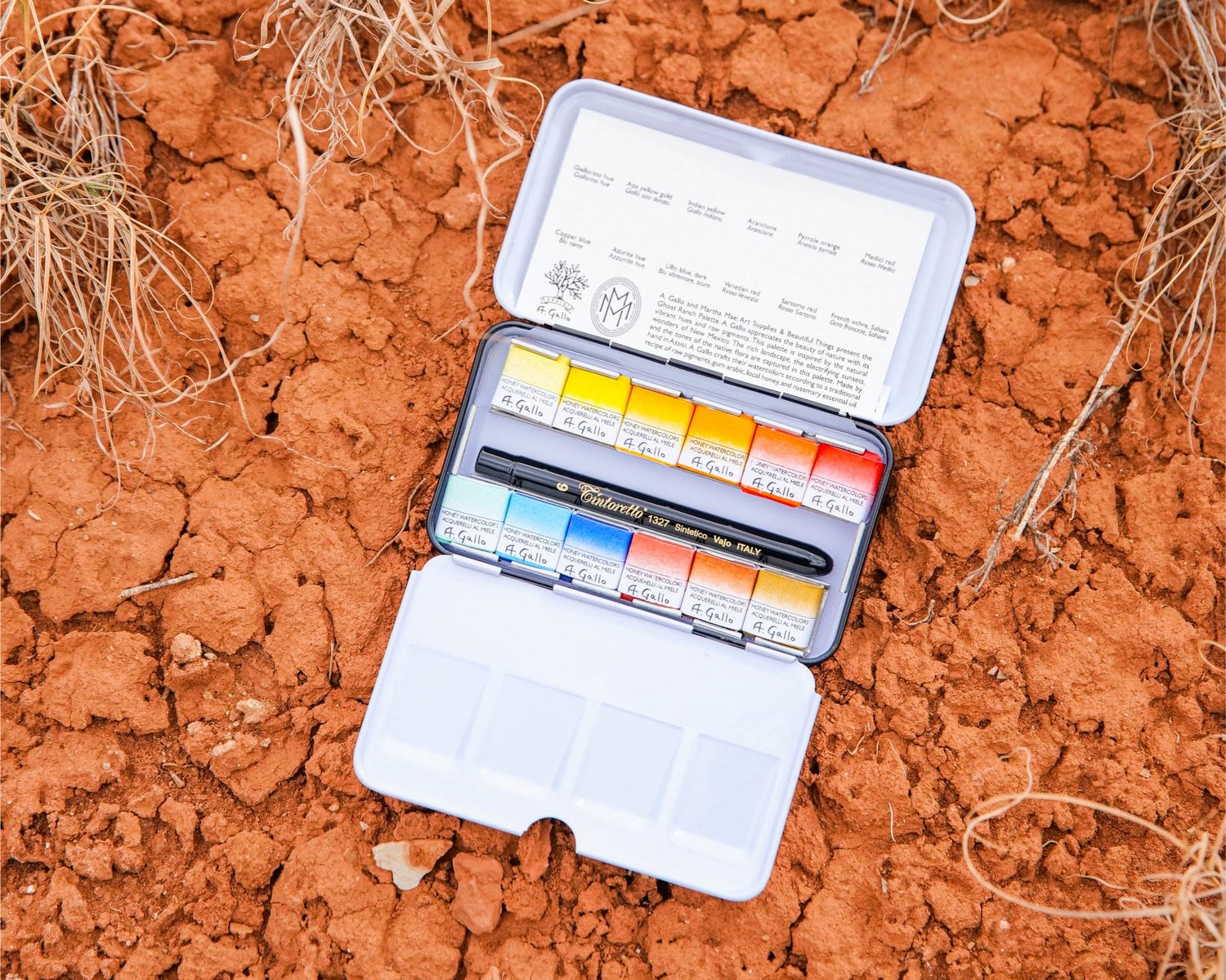
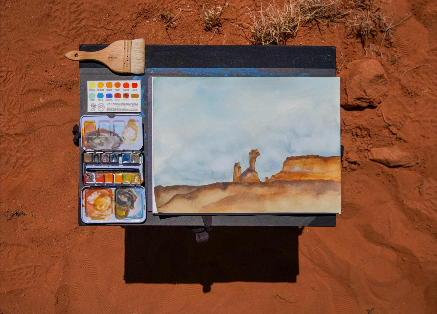
Martha Mae: Art Supplies & Beautiful Things x A. Gallo present the Ghost Ranch Palette
A. Gallo appreciates the beauty of nature with its vibrant hues and raw pigments. This palette is inspired by the natural wonders of New Mexico. The rich landscape, the electrifying sunsets, and the tones of the native flora are captured in this palette.
Colors include: Copper Blue, Titanium Yellow Hue, Azo Yellow Gold, Arancione, Medici Red, French Ochre Sahara, Satorio Red, Azurite Hue, Pyrrole Orange, Indian Yellow, Venetian Red, Ultramarine Blue Dark
Every batch of paint is made from premium pigments and hand poured into pans. This intensive process creates a very pigmented, luminous, and pure paint with excellent lightfastness that activates beautifully when wet.
Each palette contains a Tintoretto 1327 size 6 pocket round brush. It features Kazan squirrel synthetic fiber, nickel plated brass ferrule, and metallic cap-handle.